
Finding and Visualizing Local Data
With police budgets making national news, we’ve had many requests about what data we have about policing in Hawaiʻi. We did a quick check of the operating budgets for Honolulu available online to find quick breakdowns.
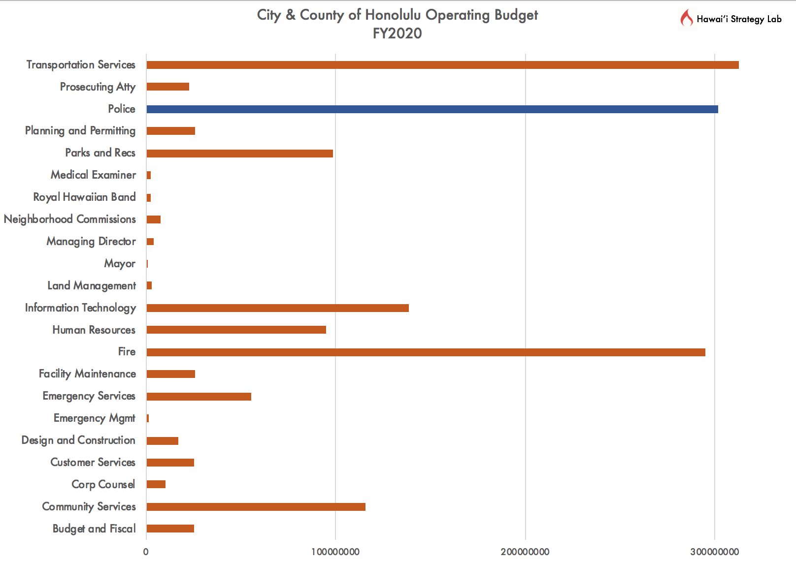
City and County of Honolulu has their operating budget readily available as a pie chart. Many data visualization studies show that pie charts are difficult for the human eye to read and use to compare values. Additionally, the pie graphs in the City data include other operating expenses such as fringe benefits.
We took the information from the spreadsheet tables of the standard operating budget and made a bar graph with the information for comparison.
Many times, local data are available. We just need to think about how we want to present and visualize the information.
Some other questions to consider: this is operating data, so it does not include the capital projects spending, or those expenditures related to building projects. This data is also presented as categorized by the city. If we created broad categories like justice, what would the comparisons look like by looking at how much we spend on resources for police and prosecution of all those things we conceive of as crimes or infractions? These data are only those police funded by the county. State sheriffs also take other enforcement roles. The City often receives federal funds that these departments administer as well, which may not be captured in this budget data. The data in this chart starts the inquiry. There is always more we can consider.